
Logo
Logo Colour Palette
#ff8899
#ffc897
#fffa97
#a6ffb3
#8fdaff
Packaging Design
A) Blue Berry Flavoured
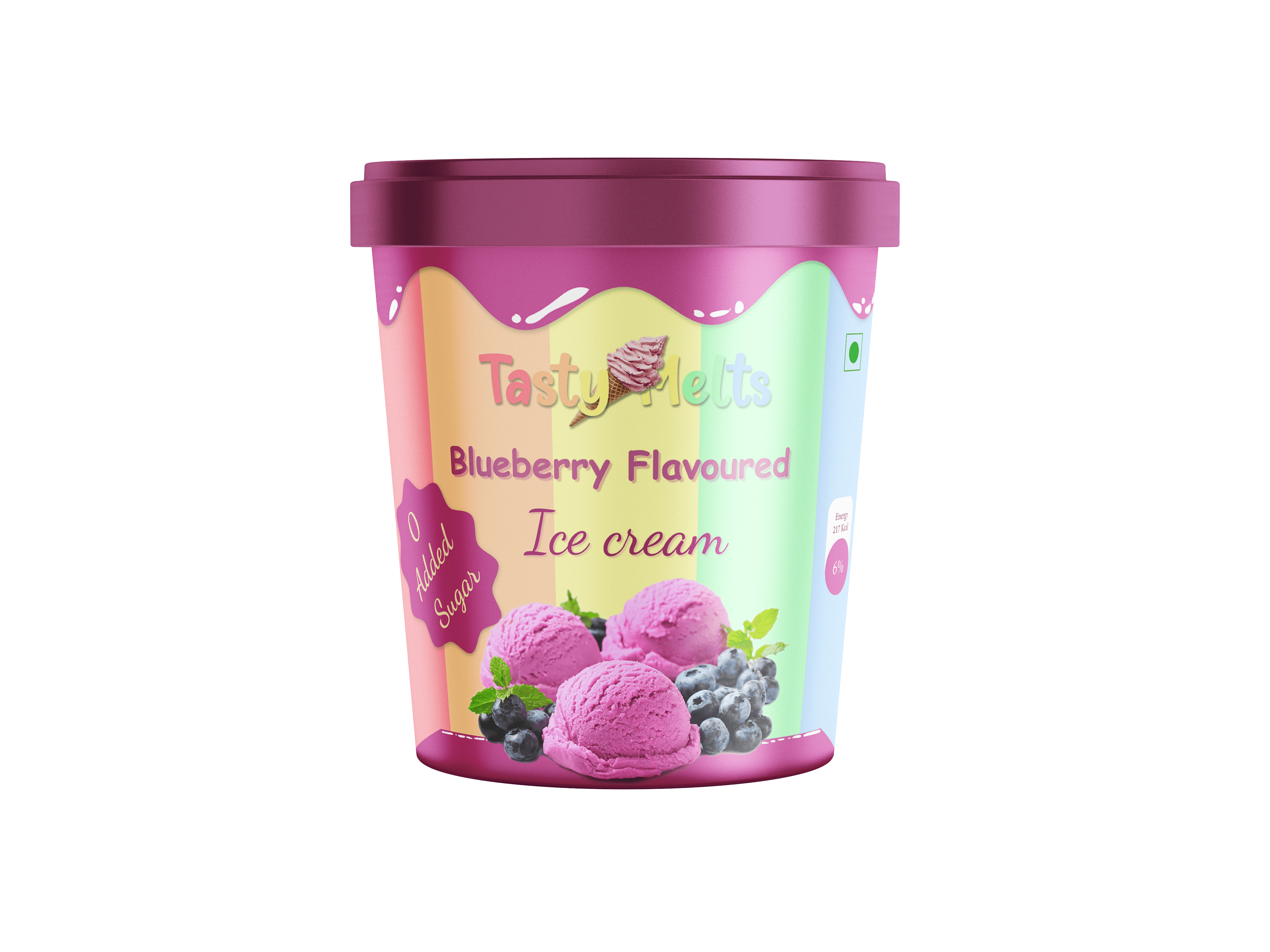
The design combines soft pastel gradients with vibrant product imagery to evoke a sense of coolness and indulgence. Playful typography and clear labeling — including the “0 Added Sugar” badge — make it both eye-catching and informative. The goal was to craft a visually appealing package that connects with modern, health-conscious consumers while maintaining a cheerful, irresistible charm on shelves.
B) Strawberry Flavoured

A warm red-pink palette was chosen to reflect the richness of strawberries, while the soft gradient background gives it a fresh and inviting feel. The realistic fruit and scoop visuals add to the product's taste appeal, and playful yet readable typography ensures strong shelf impact. This packaging concept balances visual charm and clear communication, making it ideal for modern retail spaces and conscious consumers.
C) Mango Flavoured

A golden-yellow theme evokes the freshness and sweetness of ripe mangoes. Realistic fruit illustrations and splashes enhance appetite appeal, while the “0 Added Sugar” badge clearly highlights the brand's health-conscious messaging. With playful yet clean typography and a balanced layout, this design ensures strong visual shelf presence while connecting with both kids and adults alike.